Typography is more than just choosing pretty fonts; it’s an essential part of design that impacts readability, branding, and user experience. Whether you’re designing a website, crafting a logo, card, or laying out a magazine, selecting the right font pair can elevate your work. But how do you ensure your font choices complement each other instead of clashing?
Font pairing is the art of combining two or more typefaces in a way that creates visual harmony, maintains readability, and strengthens the design’s purpose. A well-paired font combination can guide the reader’s eye, evoke emotions, and reinforce brand identity. In contrast, a poorly chosen pair can make a design look chaotic or unprofessional.
In this guide, we’ll explore core font pairing principles, common mistakes to avoid, and tried-and-true techniques to create stunning typography combinations.
Core Font Pairing Principles
Mastering font pairing requires a deep understanding of key design principles. Here are the essential guidelines to keep in mind:
1. Contrast vs. Harmony
Balance is everything. Fonts that are too similar can blend together and lose their distinctiveness, while those that are too different can feel disjointed. Aim for contrast in weight, style, or letterform while ensuring the fonts still share some common traits (like x-height or stroke consistency) to maintain harmony.
2. Hierarchy & Readability
Typography should guide the reader through content effortlessly. Establishing a clear visual hierarchy by pairing fonts with distinct weights or styles helps direct attention to key elements. For example, using a bold serif for headings and a light sans-serif for body text creates an intuitive flow.
3. Personality Matching
Fonts carry personality and mood. A playful script font might be perfect for a bakery’s branding but disastrous for a law firm. When pairing fonts, ensure their personalities align with the brand or project’s tone.
4. Font Pairing Limitations
Too many fonts can make a design feel cluttered. A good rule of thumb is to stick to two or three complimentary typefaces. If more variety is needed, consider using different weights or styles within the same font family instead of adding new fonts.

Font Pairing Mistakes to Avoid
Even experienced designers sometimes fall into common font pairing pitfalls. Here are mistakes to watch out for:
1. Using Too Many Fonts
Less is more. Overloading a design with multiple typefaces can confuse the viewer and reduce readability. Stick to a primary and a secondary font, adding a third only if necessary.
2. Mismatched Mood & Tone
A Gothic display font won’t pair well with a lighthearted handwritten script. Ensure that your font choices complement the message and brand identity you’re conveying.
3. Ignoring Readability
Some fonts may look beautiful but are difficult to read, especially at smaller sizes. Always test font pairings in real-world use cases to ensure readability across different devices and platforms.
4. Overusing Decorative Fonts
Decorative or display fonts should be used sparingly. They work best for headlines or accents but should not be used for body text, as they can strain the reader’s eyes.
Common Font Pairing Techniques
If you’re unsure where to start, these proven techniques can help you find the perfect font pair:
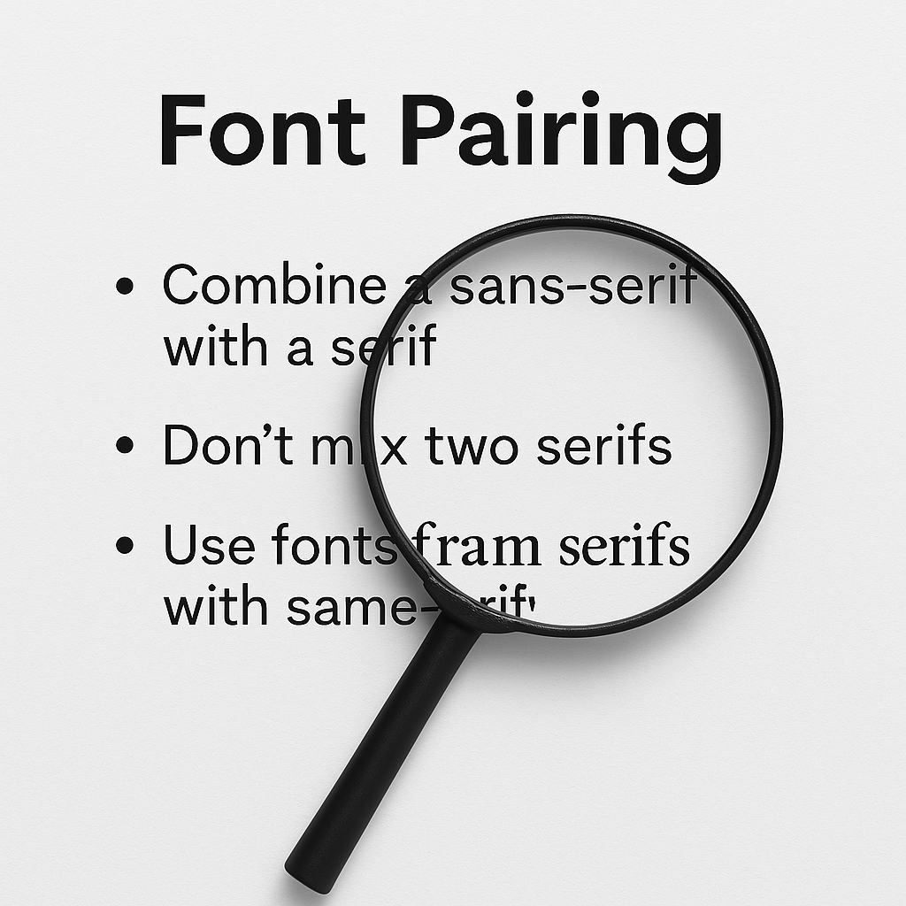
1. Serif + Sans-Serif: The Timeless Classic
A serif font for headings and a sans-serif for body text creates a sophisticated, professional look. Example: Playfair Display (Serif) + Montserrat (Sans-Serif).
2. Using Font Superfamilies
Superfamilies include both serif and sans-serif versions of the same typeface, ensuring perfect harmony. Example: Roboto (Sans-Serif) + Roboto Slab (Serif).
3. Mixing Weights & Styles
Instead of choosing two different fonts, try using multiple weights from the same family to create contrast while maintaining consistency. Example: Lato Light + Lato Bold.
4. Script & Sans-Serif: Elegance Meets Simplicity
A flowing script pairs beautifully with a clean sans-serif, creating a balance of personality and readability. Example: Dancing Script (Script) + Open Sans (Sans-Serif).
5. All Caps vs. Sentence Case
Using an all-caps sans-serif for headings with a lowercase serif for body text creates a dynamic and readable structure. Example: Oswald (All Caps) + Merriweather (Serif).
By mastering these principles and techniques, you’ll be able to create typography pairings that not only look visually appealing but also serve a functional purpose in your design work. Whether you’re designing a website, a brand identity, or a printed publication, thoughtful font selection will enhance your project’s impact and professionalism.
Its playful bubble design and hand-drawn feel create a sense of excitement and energy, making it perfect for designs that need to grab attention. Quacker is a font that’s sure to make a splash!